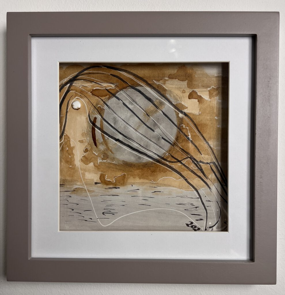
Mallorca
“I painted this Aquarelle DIN A4 picture in early 1989. Every time I look at it, I can’t help but sigh. 35 years ago? I must have been quite young. And it feels like time for a retrospective.
Back then, I primarily sketched and painted with watercolors, occasionally venturing into oil painting. However, I detested the turpentine, its odor, and the entire process.
Returning to 1989, this particular piece holds significant meaning for me. It helped me grasp the importance of paper and color blending. While it’s not flawless, I’ve always enjoyed revisiting it. Nevertheless, I quickly grew tired of realistic painting. Today, I better understand that this seemingly dull period was an essential part of my artistic journey.”
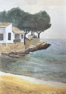
Mallorca 1989, Aquarell 21,7x29cm, framed, private stock.
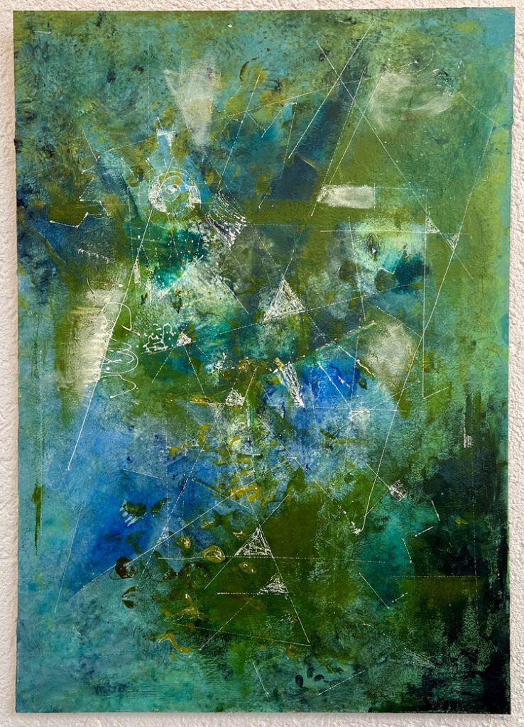
Structures
This work constitutes a significant contribution to my ongoing research into structured surfaces. I have always been drawn to the tactile nature of art, often creating pieces designed to be touched or interacted with. The traditional notion of painting as a timeless artifact has never resonated with me. While historical documentation holds value, contemporary technology enables us to preserve and share artwork digitally, allowing it to exist in the present moment. This approach aligns with my belief in the importance of multi-sensory experiences, which distinguishes tactile art from purely digital or performative works
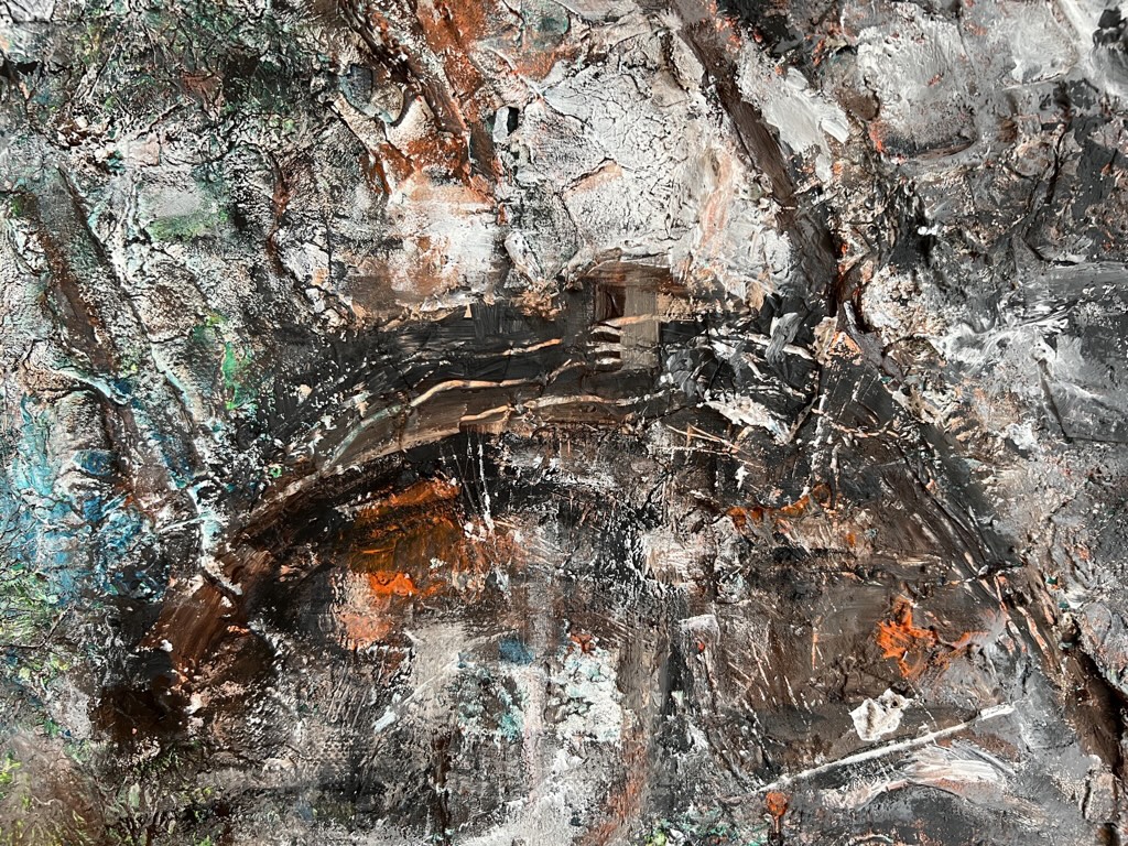
Revival of the vinyl 2019, 40x30cm, Structure paste and Acryl on canvas, private stock
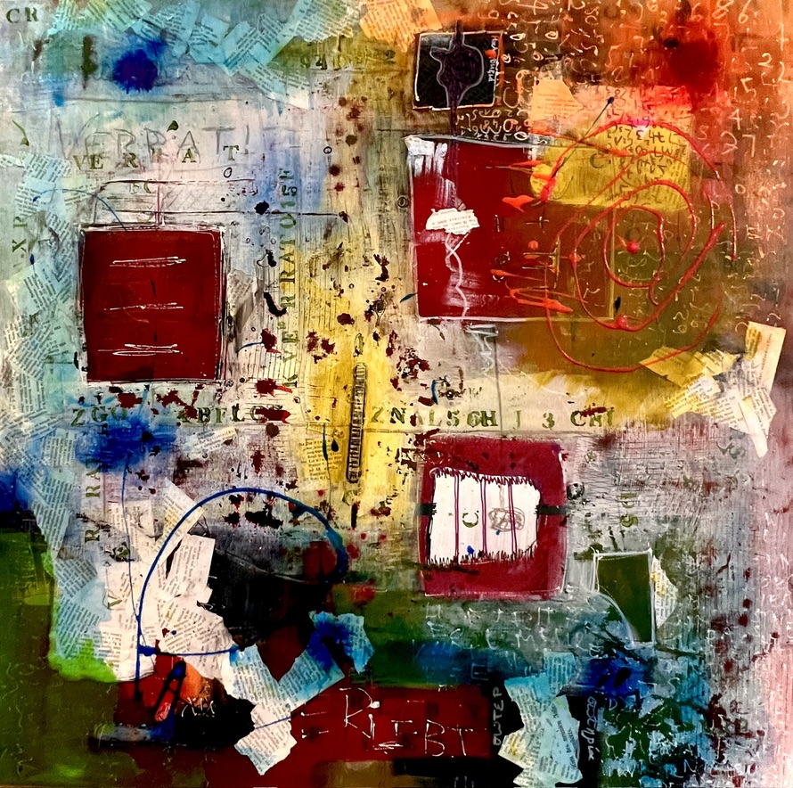
Corona
Created during the COVID-19 pandemic, this piece incorporates multiple layers of squeegee technique, mixed-media collage, and structure paste on canvas. It was only after this tumultuous period that I named it “Corona,” as it serves as a visual reminder of that toxic time. The work’s chaotic and disjointed nature reflects the unnatural, illogical, and disruptive nature of the pandemic. However, beneath the surface, it also reveals a detailed and sensual background, characterized by cracks, transparencies, and contrasts.
When Jürgen compared it to Miró’s work “design for a tapestry” and pointed out the visual similarities, I was convinced. While this piece holds significance in its current context, it ultimately needs move on. In expressionistic art, the meaning and impact are dependent on the viewer’s interpretation. The artist’s expression becomes the viewer’s reality, and their interpretation is far more valuable than the artist’s intent.
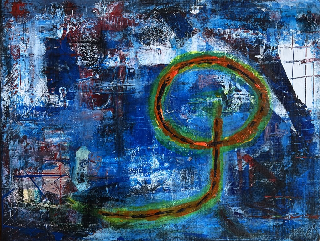
Corona, 2021, Mixed techniques, private stock, SOLD 2024
Go BIG
I’m not your average artist, although I look way better than many instagram influencers.
I’ve ditched the paint-by-numbers crowd early. And I ditched going cheap. For the sake of having more fun I decided to mix my own colours from scratch. I let pigments, binders, and marble powder talk to each other – a DIY color empire that would make Bob Ross blush. The result? A vibrant, unconventional palette that’s as far from ‘home decor’ as you can get.
Check out the painting below. The left side is your standard, run-of-the-shelf color palette. The right side and that striking green bar? That’s my rebellious, self-mixed masterpiece. It’s bold, it’s unconventional, and it’s definitely not for the faint of heart. And it has nothing to do with tennis. Or you think so?
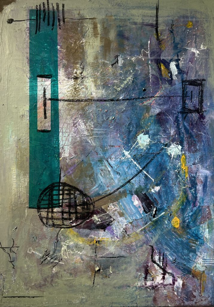
Why would a painting take over a year to complete? I believe a painting is never truly finished; there’s always room for improvement, whether it’s adding a layer, sanding it down, or repainting. However, there comes a point when you’ve reached a level of satisfaction. Only then should it be shared with others.
My multi-year Easter project delves into themes of passion, resurrection, human depravity, and the hope of new life. While some of my work has religious undertones, I don’t overly focus on them. Ultimately, my faith in Jesus Christ provides a foundation that money or admiration cannot. It’s a personal belief that grounds me and allows me to pursue my artistic endeavors.
In this piece, I experimented with fully transparent colors. While challenging to mix, the results were well worth the effort. By layering these transparent colours, I achieved a stunning visual effect. This work marks a significant departure from my simpler pieces, demonstrating a clear evolution in my style and a commitment to a more layered approach.
Go liquid
I also explored the integration of liquid colors into my work. While initially frustrating, I eventually mastered this technique and fell in love with the results.
In the painting above, I introduced a novel approach. I repurposed discarded back panels, breathing new life into these forgotten surfaces. The resulting piece, measuring e.g. 41x63cm, remains unframed, a deliberate choice reflecting my current focus on the creative process over traditional presentation. This unconventional approach allows the artwork to exist in a raw and unfiltered state, inviting the viewer to engage with its essence without the distraction of a frame.
The coffee detour
A delightful detour during my liquid color experiments was the ‘coffee time’ series. For a period, I embraced the serendipity of near-empty coffee pots, using their liquid remnants as an unconventional painting medium. This playful exploration yielded unexpected results, blurring the lines between art and everyday life. And surprisingly the drawings smelled great.
Go 3D
Detour number two was a wild ride into the world of sculpture. I’ve been so enamoured with this new direction that I plan to dive back in this coming winter. Who knows what kind of monstrous creations will emerge from my studio? Stay tuned for the next instalment of the ‘Artist Gone Wild’ show!
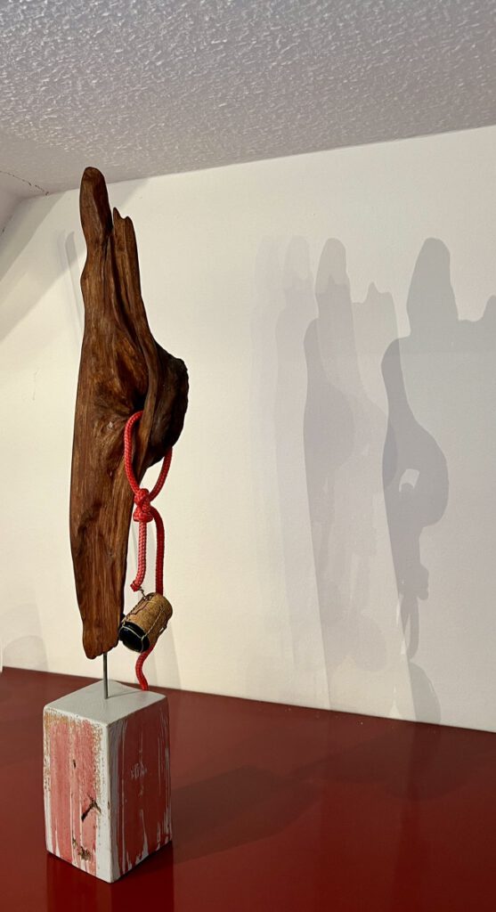
Title: 1896, 2008
In the bustling port city of Hamburg in 1896, a grand ship christening ceremony was underway. The ship, a magnificent wooden vessel named “The Promise,” was destined for transatlantic voyages. To bless the ship and ensure a prosperous journey, a bottle of champagne was ceremoniously smashed against its hull. However, this maritime ritual took a sinister turn.
As the bottle shattered, a piece of the ship’s keel, imbued with the ship’s spirit and hopes, splintered off. This fragment, carrying the ill-fated cork, that was cast into the turbulent waters of the harbor.
Legend has it that the “Promise” was cursed from the moment of its christening. Some say a disgruntled shipyard worker, overlooked for a promotion, placed a hex on the vessel. Others whisper about a dark maritime deity, angered by the disruption of the sea. Regardless of the cause, the ship met a tragic fate, sinking mysteriously on its maiden voyage.
The piece of wood, a silent witness to the ship’s tragic fate, drifted for over a century before washing ashore in Husum, North Sea, in 2007. The cursed cork, still attached to its metal binder, remains a macabre reminder of the ill-fated ship’s baptism. Though its journey may have been short, the story it carries is vast and haunting. The only witness of the ship shows in front of. It took 112 years to be a piece Germany can be proud on.
Some turns in life make great story.
Last but not least two works from the experimental side need room:
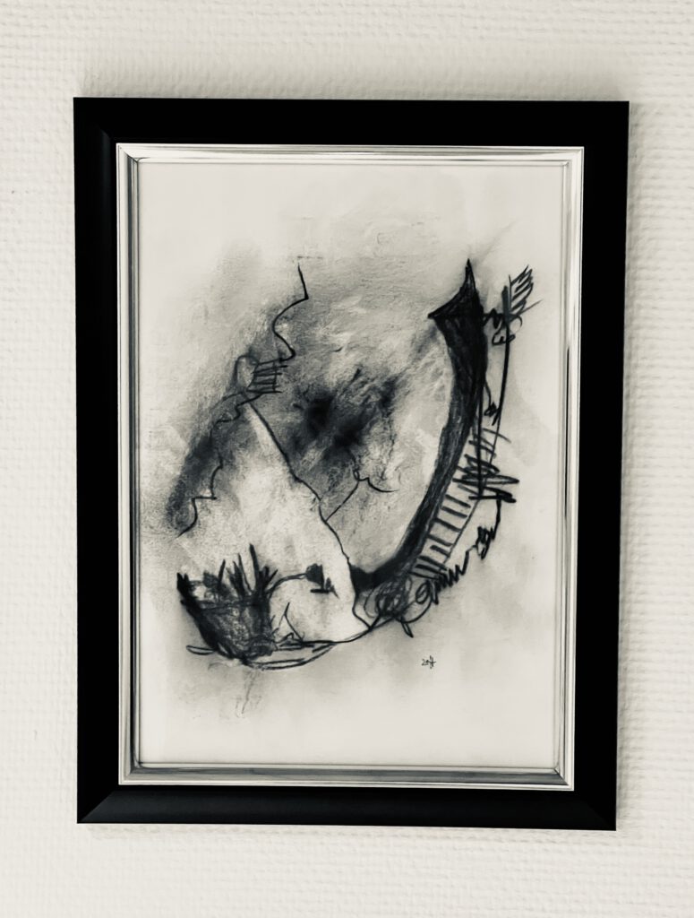
Charcoal
Abstract drawing with charcoal presented a unique challenge: maintaining true abstraction without inadvertently suggesting specific forms. I often found myself compromising, allowing my drawings to hint at recognizable objects. However, this particular piece defies easy interpretation. Is it a couple embracing in the rain, a blossoming rose, a cosmic X-ray, or perhaps a gondola? The beauty lies in the ambiguity. Ultimately, the interpretation is yours to make. I revel in the uncertainty, the open-ended nature of this abstract exploration.
Aposter in the middle of the room and painting on the floor:
Down to earth
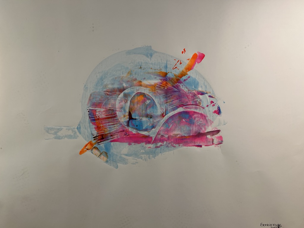
In the middle of the room I rolled out the picture. On the wrong side. 2m by 1m white space. I though: I need a quencher. Got it and named the work “quencher”.